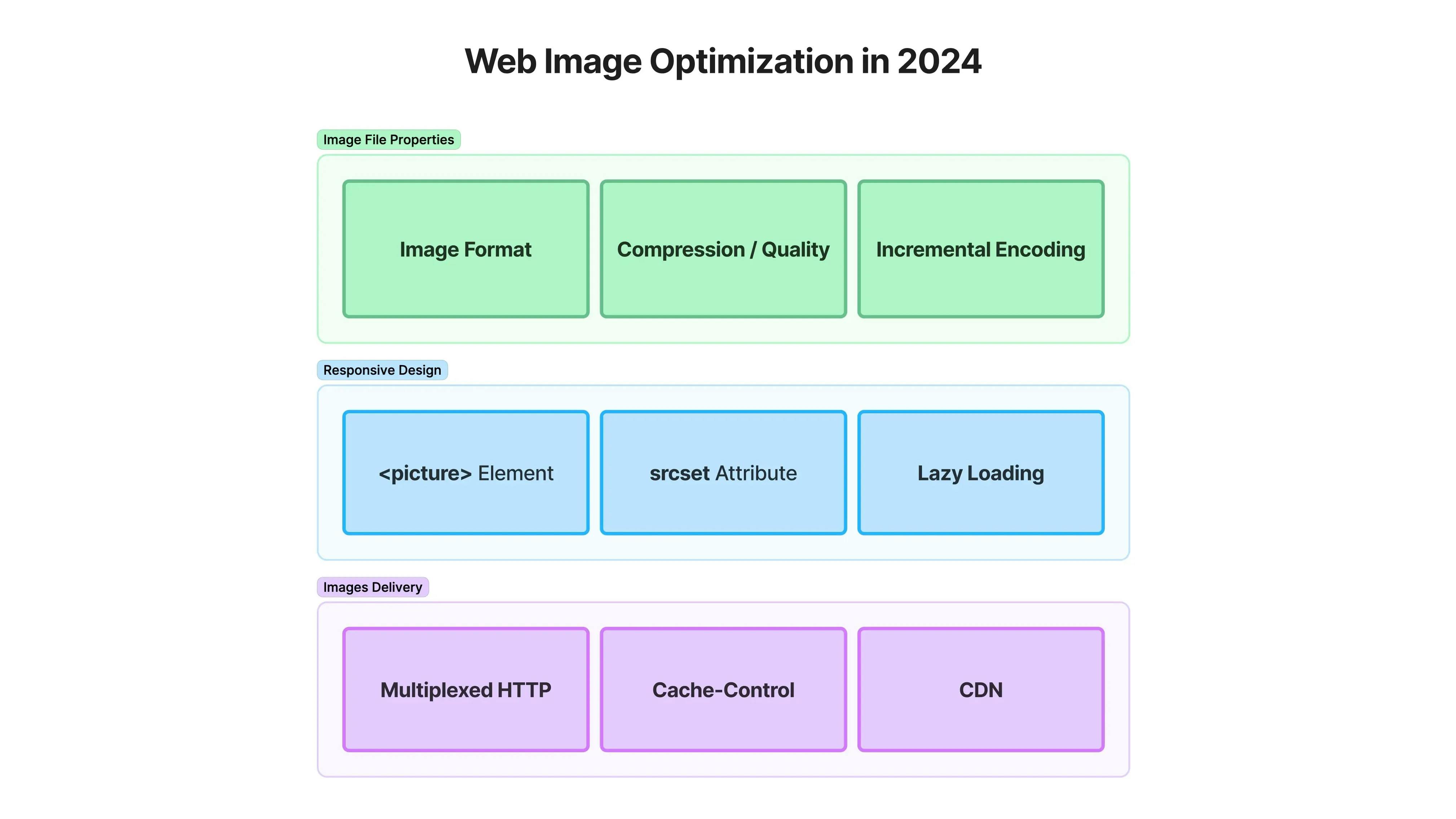
⚡️ Intro: images affect your performance, SEO, and cloud costs
Images are a vital part of the user experience. However, if not managed properly, they can significantly impact your site's performance. Poorly optimized images can lead to slow load times and high bandwidth usage, which can affect your site’s Web Vitals — key metrics Google uses to evaluate page performance. These metrics include Largest Contentful Paint (LCP), Interaction to Next Paint (INP) (that replaced the First Input Delay metric recently), and Cumulative Layout Shift (CLS). If your images are not optimized, you risk scoring poorly on these metrics, which can harm your SEO rankings and drive users away.
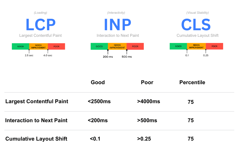
Storage and bandwidth costs. Fast-loading images improve user satisfaction and engagement, reduce bounce rates, and increase conversion rates. Moreover, by properly managing images, you can save on storage and bandwidth costs, making your application more efficient and cost-effective.
With various approaches and tools available today, it’s essential to understand your options for working with images. Choosing the right techniques for optimization, serving, and caching can save you a significant amount of time and money. This article provides a comprehensive guide to help you implement best practices for managing images in modern web applications, focusing on most practical investments. Diving in!
🎞️ Image Formats in 2024
Choosing the right image format is the first step towards optimizing images for the web. Let’s focus on the most relevant formats, covering most of the use-cases for a web application.
AVIF - today’s king
Since January 2024, AVIF is supported by all major browsers
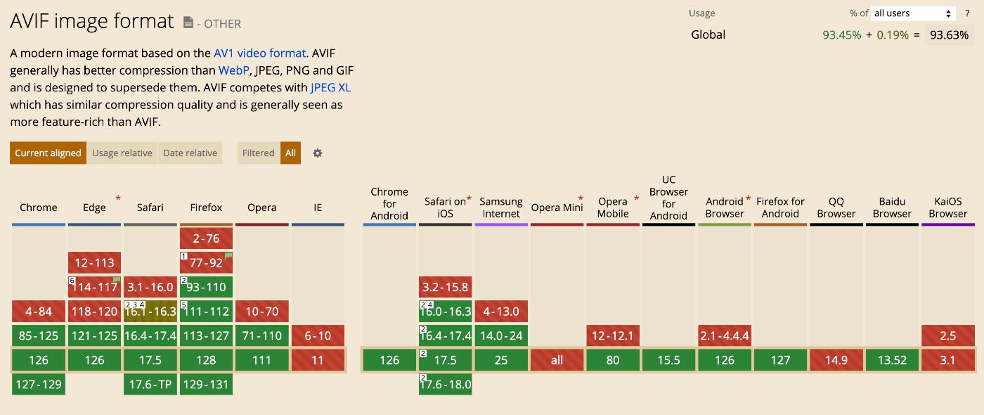
AVIF (AV1 Image File Format) offers superior compression and quality compared to jpeg, png, and webp. It supports both lossy and lossless compression, transparency, and even animated images, making it a strong replacement for GIFs. AVIF’s lossy compression provides excellent quality at smaller file sizes by efficiently encoding image data, while its lossless compression maintains original quality with highly effective compression.
- Images can be up to 10x smaller than JPEGs of similar visual quality.
- It includes support for monochrome images and multichannel images, including transparent images that use the alpha channel.
- It supports 12 bits of color depth enabling high dynamic range (HDR) and wide color gamut (WCG) images with a better span of bright and dark tones and a broader range of luminosity.
Use Cases for AVIF
- Photographs and complex images (lossy AVIF)
- Graphics requiring transparency (lossless or lossy AVIF)
- Animated images (replacing GIFs). Examples!
- General-purpose images for web applications
Tooling
- Convert online to .avif: https://squoosh.app/
- Convert to AVIF in NodeJS: https://sharp.pixelplumbing.com/
- Convert to AVIF in GO: https://github.com/Kagami/go-avif
WebP vs AVIF
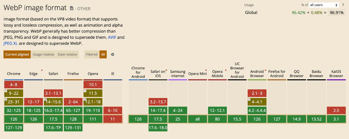
WebP, developed by Google, is a versatile format that supports almost all same features - lossy and lossless compression, transparency, animation. And it’s totally viable for all the same use-cases as AVIF.
- WebP has a slightly wider coverage by older browsers (though difference might be insignificant for 2024).
- Though WebP compression is decent (much better than JPEG or PNG), AVIF provides even better one.
- Encoding AVIF images can be slower than WebP due to its more complex compression algorithms, requiring more processing power and time.
So, it seems like AVIF is your default choice, if processing power or encoding speed is not a concern. Otherwise - consider WebP.
SVG (Scalable Vector Graphics)
SVG is a vector image format that uses XML to define shapes and paths, making it resolution-independent and infinitely scalable without losing quality. Unlike raster formats, SVG does not use traditional compression methods because it represents images as geometric shapes and paths rather than pixel data. This makes SVG ideal for icons, logos, and graphics that need to be displayed crisply at any size. Additionally, SVG files are often smaller than their raster counterparts for simple graphics, making them a great choice for performance.
Use Cases for SVG
- Icons and logos
- Scalable graphics and illustrations
- Simple graphics that benefit from resolution independence
Do We Still Need PNG?
The short answer is - yes, for a few straightforward cases.
- Universal Compatibility: For projects that need to support all browsers, including very old ones that might not support AVIF, PNG is still the safest choice.
- Lossless Images: When absolute lossless quality is required, PNG remains the go-to format.
- Transparency and Simplicity: For simple graphics, logos, or icons where transparency is needed, and the extra compression efficiency of AVIF is not critical, PNG is straightforward and effective.
Summing up on Formats
|
Use Case |
Format |
Reason |
|---|---|---|
|
General-Purpose Images, Photographs, Complex Images |
AVIF or WebP |
Superior compression and quality (AVIF), good compression and quality with broader support (WebP) |
|
Graphics with Transparency |
AVIF, WebP, or PNG |
AVIF and WebP offer transparency with better compression; PNG for universal compatibility |
|
Animated Images |
AVIF of video |
Better compression and quality than GIF |
|
Icons and Logos |
SVG |
Scalable without losing quality, small file size for simple graphics |
|
Scalable Graphics and Illustrations |
SVG |
Resolution-independent and lightweight for vector graphics |
|
Precise Graphics, Text, Logos |
PNG |
Exact pixel preservation, universally supported |
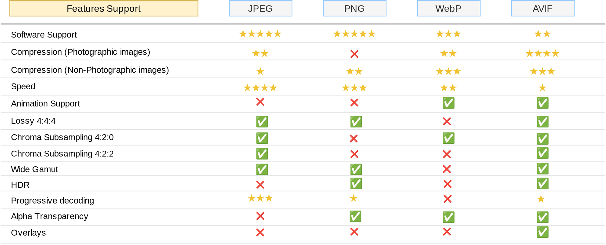
Here’s a great detailed article from Addy Osmani about various image formats: https://www.smashingmagazine.com/2021/09/modern-image-formats-avif-webp/
📦 Image Compression
How to choose the right compression rate? No silver bullet here, you’ll need to iterate to find the perfect balance for your particular requirements.
Lossless vs Lossy Compression
If a slight quality loss is acceptable, you can leverage lossy compression to additionally reduce file size.
“Hack” - Larger Images & Higher Compression Rates
If you have control over images production, the following technique might be explored:
- start with twice larger originals (let’s say 2000px images if your largest container would be 1000px)
- compress with quality setting of 50%
The result might be sharper in the end then if you compress a 1000px image with 75% quality, with a similar resulting file size.
Two things to keep in mind here:
- tune settings and compare results on high-resolution displays
- larger initial file sizes (storage costs)
- more processing power for resizing and compression
AVIF Incremental Encoding
Incremental encoding in AVIF allows images to be decoded progressively, similar to progressive JPEGs, so users see a low-quality version of the image almost immediately, which progressively improves in quality. This reduces the perceived load time.
Increased file size. Incremental encoding process might slightly increase the file size compared to a non-progressive AVIF.
Use-cases:
- High-Resolution Images: For high-res heavy images where the initial load time is significant, incremental encoding can provide a better user experience.
- Content-Rich Websites: Websites with many images, such as e-commerce sites or photography portfolios, can benefit from faster perceived loading times.
While AVIF is supported by most modern browsers, incremental decoding support may vary. It’s essential to test across different browsers to ensure consistent behavior.
📱 Responsive Images with <picture> and srcset
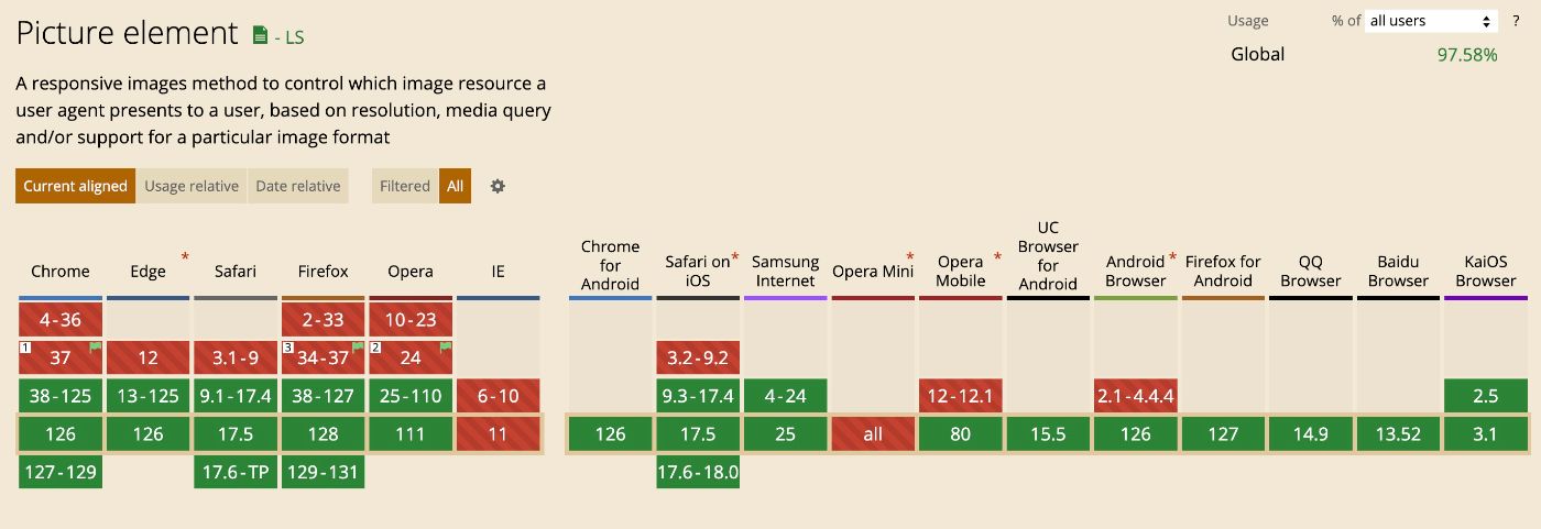
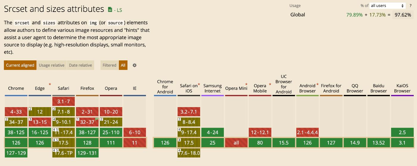
Now let’s talk about delivering the best possible experience across different devices and screen sizes. Using the srcset and sizes attributes, and the picture element, you can provide different image versions tailored to various scenarios.
The <picture> element provides a flexible way to specify multiple image sources based on various conditions such as media queries. This allows for art direction, where different images can be served depending on the viewport size, device type, or other factors.
<picture>
  <source media="(min-width: 800px)" srcset="large.jpg">
  <source media="(min-width: 400px)" srcset="medium.jpg">
  <img src="small.jpg" alt="Example image">
</picture>
In this example:
- The browser will load large.jpg for viewports 800px wide and above.
- For viewports between 400px and 799px, medium.jpg will be loaded.
- For viewports below 400px, the fallback small.jpg will be loaded.
The srcset attribute allows you to define multiple image sources along with their sizes. The browser will automatically choose the most appropriate image based on the device’s screen size and resolution (DPR - Device Pixel Ratio).
<img
  src="default.jpg"
  srcset="
    small.jpg 480w,
    medium.jpg 800w,
    large.jpg 1200w"
  sizes="(max-width: 600px) 480px, (max-width: 900px) 800px, 1200px"
  alt="Responsive image"
>
In this example, the browser will choose the best image from the srcset list based on the viewport width and the defined sizes attribute.
Real-world example
Consider a scenario where you need to serve different images for mobile, tablet, and desktop views, with high-resolution versions for Retina displays. Here’s a comprehensive example:
<picture>
  <source
    media="(min-width: 1200px)"
    srcset="
      desktop.jpg 1x,
      [email protected] 2x">
  <source
    media="(min-width: 768px)"
    srcset="
      tablet.jpg 1x,
      [email protected] 2x">
  <source
    media="(max-width: 767px)"
    srcset="
      mobile.jpg 1x,
      [email protected] 2x">
  <img
    src="fallback.jpg"
    srcset="
      mobile.jpg 480w,
      tablet.jpg 800w,
      desktop.jpg 1200w"
    sizes="(max-width: 767px) 480px, (max-width: 1199px) 800px, 1200px"
    alt="Responsive image"
  >
</picture>
In this example:
- Desktop View (1200px and above): The browser will choose between desktop.jpg (standard resolution) and [email protected] (high resolution).
- Tablet View (768px to 1199px): The browser will choose between tablet.jpg (standard resolution) and [email protected] (high resolution).
- Mobile View (767px and below): The browser will choose between mobile.jpg (standard resolution) and [email protected] (high resolution).
- Fallback: If the <picture> element is not supported, the <img> element ensures a responsive image is still served, adjusting to the appropriate size based on the viewport width.
🎨 CSS Tricks
There are a bunch of css tricks to mitigate the long download time, feel free to google them, but we’ll skip them in this article to save the focus on the root-cause stuff - optimizing assets themselves or their loading strategy. One of the obvious tricks listed below.
Background Color Placeholder
You can pre-calculate the dominant color of every image, store this metadata, and return to the client together with the image URL. With CSS, you can show the solid color placeholder until the image is loaded.
<style>
  .image-wrapper {
    background: #f0f0f0; /* Use a dominant color from the image */
    width: 100%;
    height: 300px;
    display: flex;
    justify-content: center;
    align-items: center;
  }
  .image-wrapper img {
    display: block;
    max-width: 100%;
    opacity: 0;
    transition: opacity 0.5s ease-in-out;
  }
  .image-wrapper img.loaded {
    opacity: 1;
  }
</style>

<div class="image-wrapper">
  <img
    src="high-quality.avif"
    onload="this.classList.add('loaded');"
  >
</div>
🌀 Lazy Loading
What is Lazy Loading?
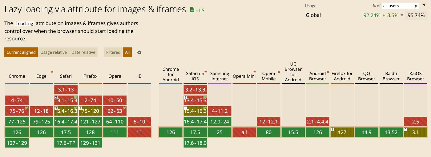
Lazy loading is a technique that delays the loading of images until they are about to enter the viewport. This reduces the initial page load time and bandwidth usage.
Implementing Lazy Loading with Native loading Attribute
Modern browsers support native lazy loading with the loading attribute on img elements.
<img src="image.jpg" alt="Example image" loading="lazy">
For more advanced lazy loading capabilities, you can use third-party libraries like LazySizes and Lozad.js.
Don’t mark all images as lazy by default. Use loading=lazy only for images outside the initial viewport. The browser can't lazy-load an image until it knows where the image should be on the page, which causes them to load more slowly. For images “above the fold”, use browser’s default eager loading.
Define dimension attributes for the image, if possible. While the browser loads an image, it doesn't immediately know the image's dimensions, unless they're explicitly specified. To let the browser reserve enough space on a page for images, and avoid disruptive layout shifts, add width and height attributes to all <img> tags.
For example, Chrome does some internal calculations to decide whether it’s the time to load every “lazy” image. And that threshold may vary on your connection speed. Knowing your images dimensions - those calculations would become possible.
🌐 Networking: HTTP Protocol, Client-side Caching, CDN
HTTP Protocol
HTTP/2 and HTTP/3 provide significant performance improvements over HTTP/1.1 by enabling parallel downloads, reducing latency, and improving overall efficiency. HTTP/2 allows multiple requests and responses to be sent over a single connection simultaneously. This reduces the overhead of establishing multiple connections and improves the parallel loading of resources, including images.
Setting Cache-Control Headers for Images
The Cache-Control header allows you to define how long a browser should cache an image before revalidating it with the server.
Cache-Control: max-age=31536000, public
Define caching duration based on the images change frequency - from year or months for rarely changes ones like article images or product images, to weeks or days for user-generated content or profile pictures.
Example for nginx:
location ~* \.(jpg|jpeg|gif|png|webp|svg|avif)$ {
    expires 1y;
    add_header Cache-Control "public, max-age=31536000";
}
If you’re using images CDN - they also usually have cache settings.
Benefits of Using a CDN for Images

Serving images from the CDN, you’re:
- removing media assets serving load from your infrastructure
- ensuring that customers will download images from the geographically closest servers
- leveraging their built-in optimization capabilities, simplifying your system (not spinning up your services and infra to do compression, transformations, resizing, etc)
Depending on the maturity and priorities of your engineering team, you can choose between self-managed and 3rd-party-managed CDN.
Your options for self-service CDNs: Thumbor, Imaginary, Imagor.
A CDN distributes your images across multiple servers worldwide, ensuring faster delivery to users by serving images from the nearest server.
https://my-site.some-cdn.com/image.jpg
	?key=j23hJas
	&quality=auto
	&size=300
	&format=webp
Popular Image CDNs: Fastly, Cloudinary, Imgix, Akamai, Cloudfront.
🚨 Continuous Performance Monitoring and Testing
Google Lighthouse
- Largest Contentful Paint (LCP): Ensure your largest image above the fold loads quickly.
- Cumulative Layout Shift (CLS): Large images should not cause layout shifts.
You can integrate Lighthouse audits into your CI pipeline with lighthouse CI:
npm install -g @lhci/[email protected]
lhci autorun
WebPageTest
- Start Render: When the first content appears on the screen.
- Speed Index: Average time at which visible parts of the page are displayed.
- Image Analysis: Check the image optimization section for recommendations.
You can trigger a perf test right from your pipeline:
curl -X POST "https://www.webpagetest.org/runtest.php?url=http://www.example.com&k=YOUR_API_KEY"
Check image sizes with JavaScript
You can inject a simple JavaScript script to check the sizes of all images on your website. This script can help you identify heavy images that may not have been optimized or correctly served via a CDN.
Here’s an example of script you may use:
- Loop through all the images on the page
- Get the image sizes
- Log any images that exceed a specified size threshold
<script>
  (function() {
    const SIZE_THRESHOLD = 100 * 1024; // 100 KB

    async function getImageSize(url) {
      try {
        const response = await fetch(url, { method: 'HEAD' });
        const size = response.headers.get('content-length');
        return parseInt(size, 10);
      } catch (error) {
        console.error(`Error fetching image size for ${url}:`, error);
        return 0;
      }
    }

    async function checkImages() {
      const images = document.querySelectorAll('img');
      for (let img of images) {
        const size = await getImageSize(img.src);
        if (size > SIZE_THRESHOLD) {
          console.warn(`Image ${img.src} exceeds the size threshold (${(size / 1024).toFixed(2)} KB)`);
        }
      }
    }

    window.addEventListener('load', checkImages);
  })();
</script>
You can include this script directly in your HTML file, or as part of a larger JavaScript file. Log alerts to Sentry or any other system so you can have a reporting of images that are exceeding your limits.
⭐️ Summing up! Best Practices Checklist
- Choose the right image format based on the use case. Leverage AVIF since it’s now supported by all major browsers. SVG and PNG still serve their cases
- Optimize images using lossless or lossy compression. Iterate to find the right quality/size balance for your needs
- Leverage <picture> element and srcset attribute API to serve responsive images depending on screen sizes, DPR, or even connection speed
- Stay aware of CSS tricks to have placeholders, preserve the page layout from shifts
- Lazy-load non-LCP images
- Use multiplexed HTTP/2 or HTTP/3 so Browser can download images in parallel
- Set appropriate cache-control headers to remove extra requests for rarely changing images
- Use CDN for faster image delivery and out-of-the box optimizations
- Integrate your performance monitoring into your CI and automate your quality checks
Now you can serve cats images blazingly fast! 😺

